Register Forum
Wow, I know about YG’s aesthetic but this is a bit severe..
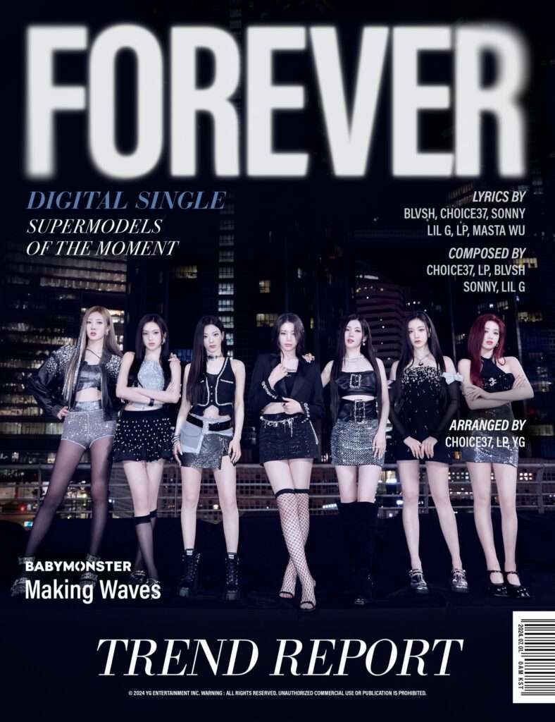
I didn’t believe it so I checked to see if it was official or not
1. Is this a magazine concept?
2. It looks like a magazine cover concept, but the way the font and text position are edited is a bit outdated
3. Looks like it’s a first year college assignment
4. It looks like a magazine cover that’s for women. But for me it’s okay
5. It’s true that YG’s font has problems…
6. I don’t mean to curse, but it seems like a normal person did it..
7. Looks like a magazine cover
8. Is this 2010? YG’s font is always bad
9. Wow, looks like they did it using PPT..
10. I think fans will make it better
11. A first-year college student made a poster of his favorite idol after learning Photoshop on YouTube
12. The members are all pretty but it looks like a women’s magazine
13. Seriously, how many years have I been talking about this? Please buy some fonts
Original post (1)